
You are currently viewing How To Create a GANTT Chart in Power BI

How To Create a GANTT Chart in Power BI

In this blog post, we walk you through how to create a GANTT chart in Power BI using only DAX, some conditional formatting, and Power BI’s built-in Matrix visual.

Power BI is a powerful data visualization tool, but one feature it has been missing natively is a GANTT chart visual. This creates a massive gap for users wanting to visualize project timelines and track task progress within Power BI.

But, if you’re a project manager or someone interested in tracking project progress in Power BI without the use of custom visuals, don’t worry Go Analytics has got you covered. Follow along for the solution.

What We're Building

Without a native GANTT chart in Power BI, it may seem that the only option is a custom visual. But, that’s not the case.

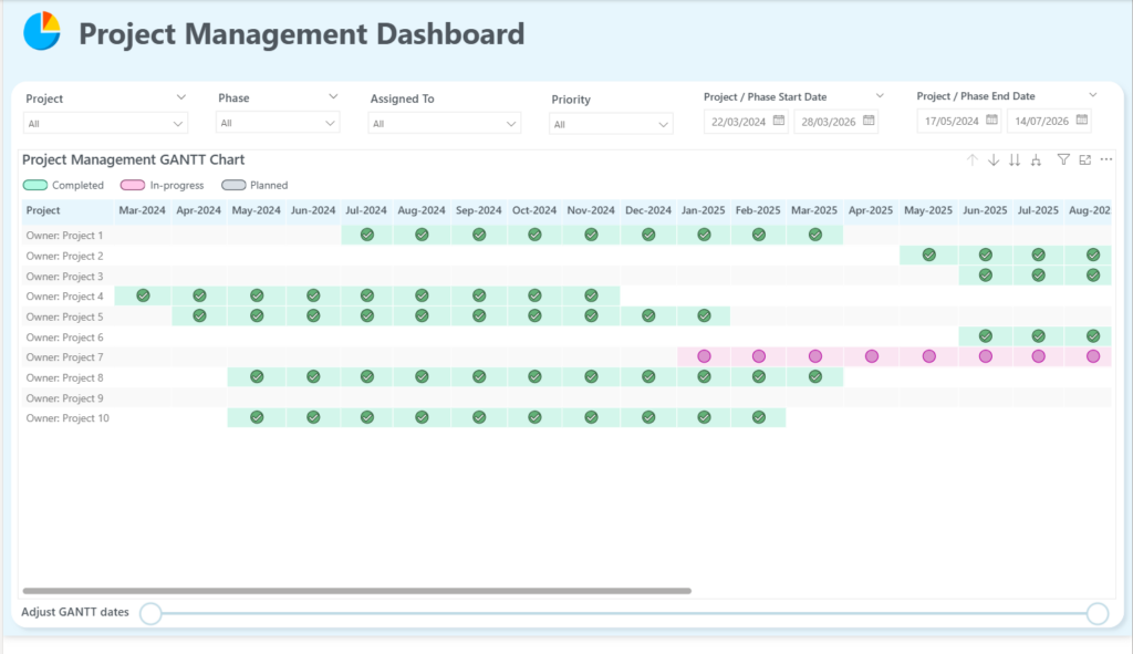
The GANTT chart we’re creating uses a Matrix visual with projects listed in rows and months displayed across the columns. Each cell is colour-coded, with an icon, to show whether a project phase is completed, in progress, or planned.

Completed Project Management Dashboard in Power BI featuring a custom horizontal Gantt chart visual for tracking project statuses.

The visual also supports full drill-down. Users can click into any project to see its individual phases or tasks, then drill down further to see which team member was assigned, along with the start date, completion date, and progress for each task. Slicers can be added to filter by priority, status, or any other field in your data. This is where you get to be creative!

So, how do we do it?

Want to follow along with our example? Download our free template!

To help you better understand how to create a GANTT chart, we put together a Power BI template and sample Excel data.

Step 1: Understanding the Data

If you’re following along with our example, the data model we used for this GANTT chart is intentionally simple. There are two tables:

  • A Dummy Projects table containing the project name, phase, start date, end date, assigned team member, priority, progress, status, and two helper columns used to control the sort order of projects and phases.
  • A Dates table containing a continuous calendar of dates.

One important detail to note: there is no relationship between these two tables. The DAX measure we write in the next step will handle the logic for matching dates to project timelines directly, so the relationship isn’t needed.

Power BI Model View showing dummy_projectsDB and DatesTable schemas for creating a Gantt chart timeline.

Step 2: Create the Project Status DAX Measure

The heart of this GANTT chart is a single DAX measure called _project status. This measure is what tells Power BI how to colour each cell in the Matrix visual. Specifically, it determines whether a given date falls inside the project window, and if so, whether the project is complete, in progress, or still planned.

Here is the full DAX measure:

_project status = 

VAR _projStart = MIN ( dummy_projectsDB[Start Date] )
VAR _projEnd = MAX ( dummy_projectsDB[End Date] )
VAR _selectDateStart = MAX ( DatesTable[Date] )
VAR _selectDateEnd = MIN ( DatesTable[Date] )
VAR _currDate = TODAY()

RETURN

SWITCH (
    TRUE(),
    OR ( _selectDateStart < _projStart, _selectDateEnd > _projEnd ), BLANK(),   -- Outside of project dates
    _projEnd < _currDate, 3,                                                    -- Completed
    AND ( _projStart < _currDate, _projEnd > _currDate), 2,                     -- In-progress
    1                                                                           -- Planned
)

Let’s break down what each part is doing and understand what’s going on.

Variables

  • _projStart — Uses MIN() on the Start Date column to get the earliest start date across all phases of a project. Since a project has multiple phases, the MIN gives us the overall project start.
  • _projEnd — Uses MAX() on the End Date column to get the latest end date across all phases, giving us the overall project end.
  • _selectDateStart / _selectDateEnd — These capture the date value from the Dates table as it appears in each column of the Matrix visual.
  • _currDate — Simply returns today’s date using the TODAY() function.

The SWITCH Logic

The SWITCH function evaluates each condition in order and returns the first match:

  1. If the selected date falls outside the project’s date range, return BLANK(). This leaves the cell empty so only the active project window is coloured.
  2. If the project end date is before today, return 3, this means the project is Completed.
  3. If today falls between the project start and end dates, return 2, this means the project is In Progress.

Otherwise, return 1 meaning the project is Planned but hasn’t started yet.

Step 3: Build the Matrix Visual

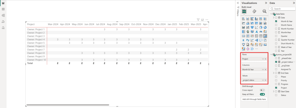
Now, create a new report page, add a Matrix visual, and configure it as follows:

  • Rows: Drag Project, from the Data pane, into the Rows data field, under the Visualizations pane.
  • Columns: Expand DatesTable, in the Data pane, and drag Month & Year into the Columns data field.
  • Values: Drag _project status, the DAX measure we just created, into the Values data field.

At this point, the visual should display a grid of numbers and blank spaces. Now, all we need to format these numbers into a proper GANTT chart.

Power BI Matrix visual canvas displaying raw numeric project status values across dates alongside the Rows and Columns configurations.

Step 4: Apply Conditional Formatting

Select the Matrix visual, open the Format pane, and make the following adjustments before adding conditional formatting:

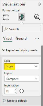
  • Under Style presets, change the layout from the default to None.
Power BI Layout and style presets menu with Style dropdown set to None to remove default matrix table styling.
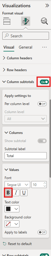
  • Under Column subtotals, remove the bold formatting and turn subtotals off.
  • Under Row subtotals, do the same, remove bold and turn them off. This ensures that when you add drill-down levels to the rows, everything appears clean and consistent.
Power BI Format Visual pane displaying configurations for column subtotals and text values styling.

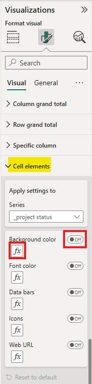
Now navigate to Cell elements under the Values formatting section. We’ll be adding two layers of conditional formatting: background colour and icons.

Background Colour Rules

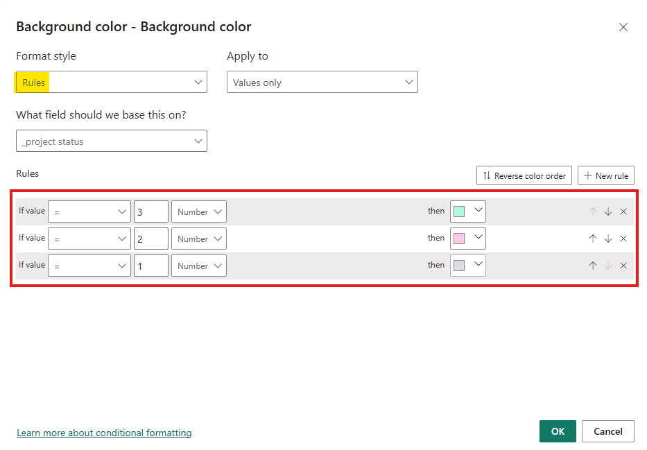
First, let’s configure the Background color. In the Format pane, click into Cell elements and turn on Background color. Then, click the fx button underneath Background color and set Format style to Rules.

Power BI Cell elements configuration menu highlighting the background color conditional formatting fx button for project status series.

Add these three rules:

  1. If value = 3 → assign green (Completed)
  2. If value = 2 → assign pink (In Progress)
  3. If value = 1 → assign grey (Planned)
Power BI background color conditional formatting settings dialog setting rules for project status values 1, 2, and 3.

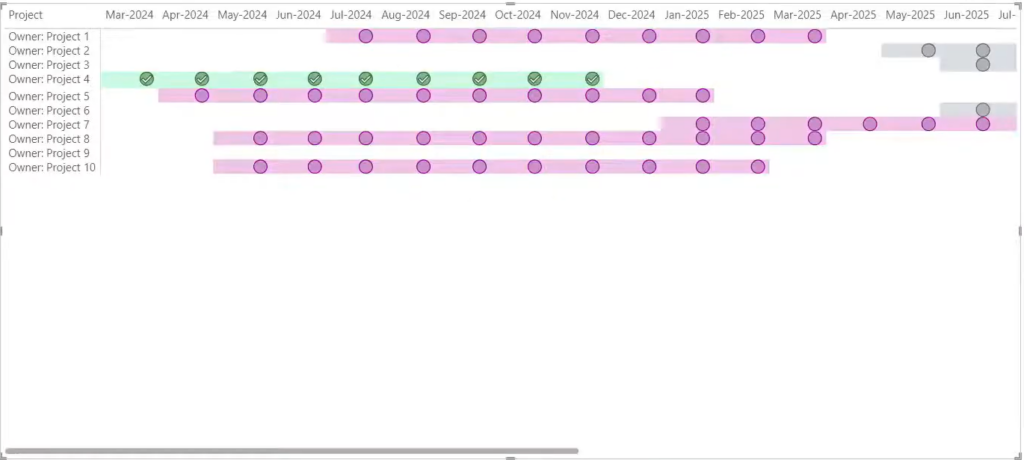
Once these rules have been applied, the visual will start to look like a GANTT chart, with coloured cells along the project timeline.

Icon Rules

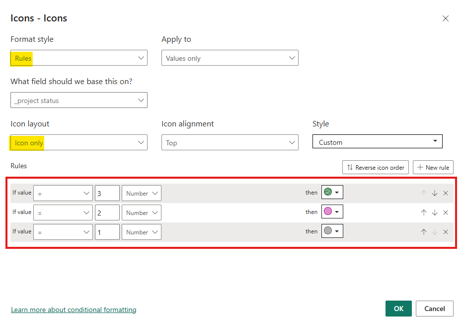
Continuing within Cell elements, turn on Icons, click the fx button underneath Icons, and again switch the Format style to Rules. Add and apply the same three rules:

  1. If value = 3 → show a checkmark icon (Completed)
  2. If value = 2 → show a pink circle icon (In Progress)
  3. If value = 1 → show a grey circle icon (Planned)
Power BI conditional formatting icons dialog window setting status icon rules based on numeric values.

Finally, change the Icon layout to Icon only. This hides the underlying numbers and shows only the icons, giving you a clean, professional-looking GANTT chart.

Step 5: Additional Styling & Slicers

At this point the core of the GANTT chart is complete. From here, it’s about making it look polished, more professional, and adding more interactivity for your users.

Some features that might be worth adding:

  • A Priority slicer so users can filter down to only critical or high-priority tasks
  • A Status slicer to isolate completed, in-progress, or planned work
  • Custom column header formatting to make the month labels easier to read
  • Company branding, such as logo, report title, etc.

So, in the end, you may end up with something like our GANTT chart report page.

Completed Project Management Dashboard in Power BI featuring a custom horizontal Gantt chart visual for tracking project statuses.

Wrapping it Up...

Creating a GANTT chart in Power BI may feel impossible without the use of custom visuals, but it is not! With a single DAX measure, a Matrix visual, and some conditional formatting, you can create a project tracking view that’s interactive, drillable, and entirely native to Power BI.

Need Help Implementing Power BI at Your Organization?

Our Microsoft Certified consultants can help