
In this blog post we walk you through how to build a Power BI slicer that looks like a web application, using nothing but the native Button Slicer, a simple DAX measure, and a hosted image.
Slicers are one of the most useful ways to let report viewers filter your data, but let’s be honest, the default look isn’t exactly exciting. In this post, we’ll show you how to transform Power BI’s Button Slicer into something that looks custom-built, with rounded pill-shaped buttons, colour changes on selection, and a little checkmark icon that appears next to whichever option is active. All this using out-of-the-box visuals, no custom visuals required.
This solution not only makes your report slicers look amazing, but they also improve the user experience by allowing users to quickly identify selected options.
If you’re a report builder who wants your slicers to feel more like a polished web app, we’ve got you covered. Follow along for the solution.
What We're Building
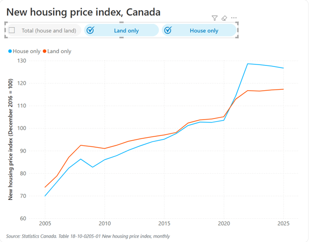
Instead of the plain, default look of a standard slicer, we’re going to build a Button Slicer styled to look like a set of web-app filter pills. Each button shows a light grey background when unselected, and switch to a soft blue background with a checkmark image when selected.
So, how do we do it?
Want to follow along with our example? Download our free template!
To help you better understand how to create these slicers, we put together a Power BI template and sample CSV data.
-
Free Power BI Template: Fancy Power BI Slicers Power BI slicers don't have to be boring! In fact, with a...
-
Free Power BI Template: Fancy Power BI Slicers Power BI slicers don't have to be...
Step 1: Enable the Button Slicer
In this example, we are using the Button Slicer visual, which allows for a lot more formatting control than the standard slicer visual. Newer versions of Power BI Desktop have this visual enabled automatically, so it should already be sitting in your Visualizations pane. If this is the case for you, just go ahead and skip to Step 2 of this tutorial.
If you’re on an older version and don’t see it there, it’s likely still behind a preview toggle, here’s how to turn it on:
- Go to File > Options and settings > Options
- Navigate down to Preview features
- Check the box for Button slicer, then click OK
- Restart Power BI Desktop
Once Power BI restarts, you’ll find the Button Slicer visual available alongside the rest of your visuals in the Visualizations pane.
Step 2: Host an Image & Create a Dax Measure
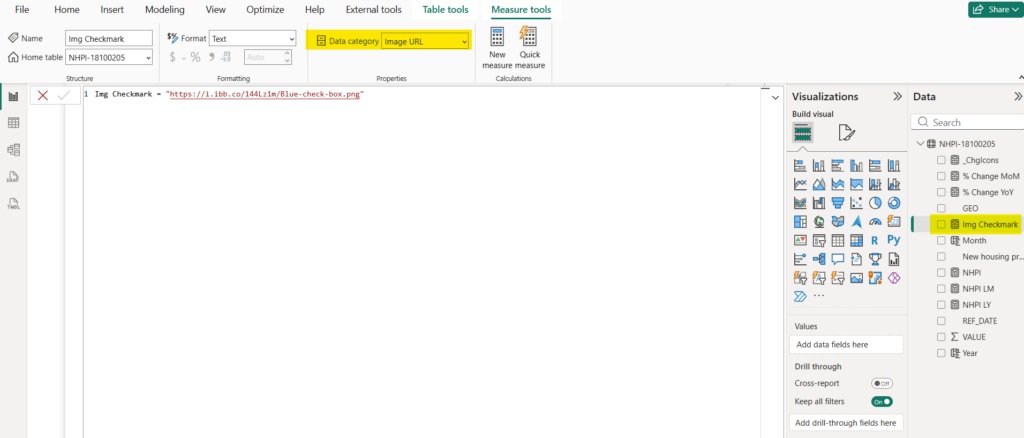
The checkmark used in the slicer next to the selected button isn’t a built-in icon, it’s an image, pulled in through a DAX measure. Here’s how to set it up:
- Design your icon (a simple checkmark works well in our example, but you can use any image) using a tool like Canva, then export it as an image.
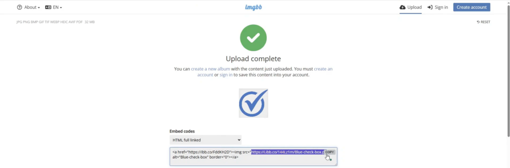
- Upload the image to a free image-hosting service, such as imgbb.com. A SharePoint folder or OneDrive link will also work, as long as it produces a direct link to the image.
- Copy the HTML full linked code from the host and grab the direct image URL from it.
4. In Power BI, create a new measure using that URL.
img check mark = “https://your-image-url-here”
5. Click on the new measure you just created, navigate to Measure tools > Data category, and set the data category to Image URL. By default it will be uncategorized text, this step is what tells Power BI to treat it as an image.
Step 3: Set Up the Button Slicer
With the prep work done, add a Button Slicer to your report and drag in the field you want to filter by into the Field well.
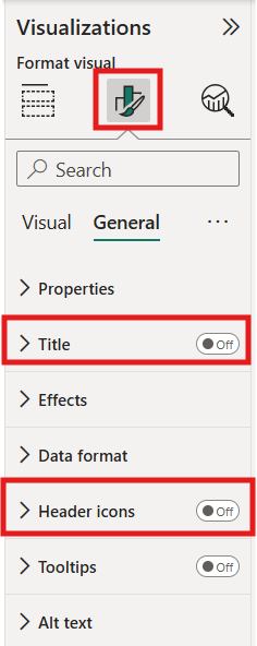
Before diving into the visuals, let’s clean up the header:
- Go to Format pane > General, and turn off Title and Header icons
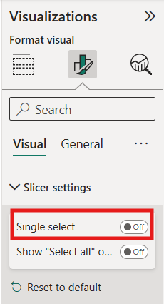
Next, head to the Visual tab and start with Slicer settings:
- In Slicer Settings, under Selection, turn off Single select if you want users to filter by more than one option at a time.
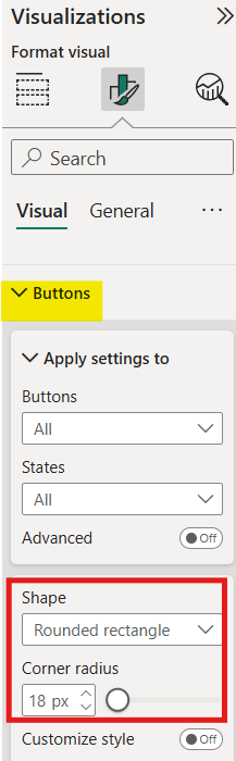
Next, we style the shape of the buttons – this is where you get to be creative or you can follow along with how we set it up:
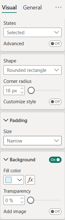
- In the Buttons section, under Shape, choose Rounded rectangle and adjust the rounding. Somewhere around 15px gives a nice pill-like look without going overboard.
Finally, we set the layout:
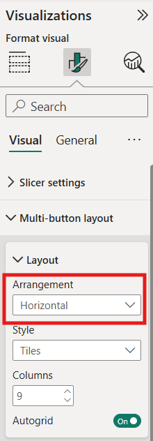
- In Multi-button layout, under Layout, make sure the Arrangement is Horizontal to keep all the options lined up horizontally. Again, this is based on how you want your slicer to look, so you could have it vertically if that’s how you want it to appear in your report.
Step 4: Add the Checkmark Image
Now bring in the image you created in Step 2:
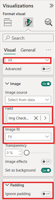
- Go to Images, set the state selector to All, and turn on images.
- Add your Img Checkmark measure as the image field.
- Change Image fit from Fill to Fit, the fill setting distorts the image.
- Uncheck Ignore padding, under Padding, otherwise the image gets pushed right up against the edge of the button.
Step 5: Additional Styling & Slicers
-
At this point, the checkmark shows on every button, which isn’t what we want. We only want it visible on whichever option is currently selected. Here’s the trick to make that happen:
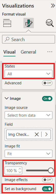
- With the state set to All, turn on Set as background and set Transparency to 100%. This keeps the padding consistent without showing the image.
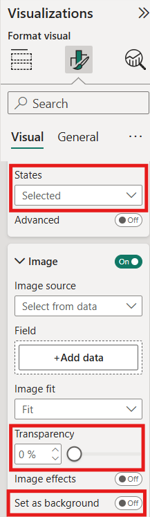
2. Now, change the state selector to Selected.
3. Set Transparency back to 0% and turn Set as background off.
Now the checkmark image will only appear beside the button that’s currently selected, everything else stays clean.
Step 6: Style the Buttons
With the layout and images sorted, it’s time to style the buttons themselves:
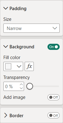
- Under Buttons > Padding, choose Narrow, or switch to Custom and set it to around 15px for a bit more breathing room.
- Turn Border off completely.
- Under Background, set the Default state to a light grey (we used hex #F6F6F6).
- Switch the state to Selected and set the fill to a soft blue that matches your checkmark image.
Step 7: Add a Selection Icon for Unselected Buttons
To give unselected buttons a visual cue too (like an empty checkbox), turn on the built-in Selection icon:
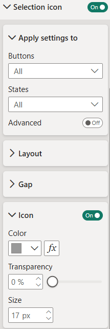
- Go to Selection icon and turn it on for the Unselected state.
- Turn the Icon off for the Selected state, since that button already has the checkmark image.
- Reduce the icon Size to around 15px so it doesn’t overpower the button.
Step 8: Format the Text
The last step is styling the label text on each button:
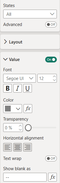
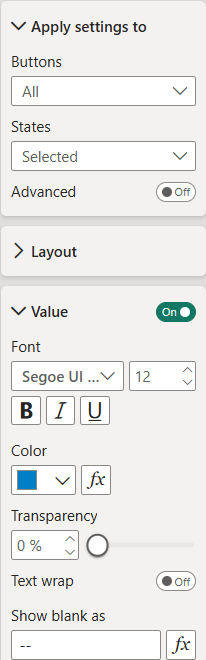
- Under the Callout section, in Values, set the font to something clean like Segoe UI at around 12pt, and resize the slicer slightly if the text is getting cut off.
- For the All state, use a medium grey so the text contrasts nicely against the light grey background.
- For the Selected state, we switch to a dark blue that matches our fill and checkmark image colours and bump the weight up to Semi-bold to make the active option stand out.
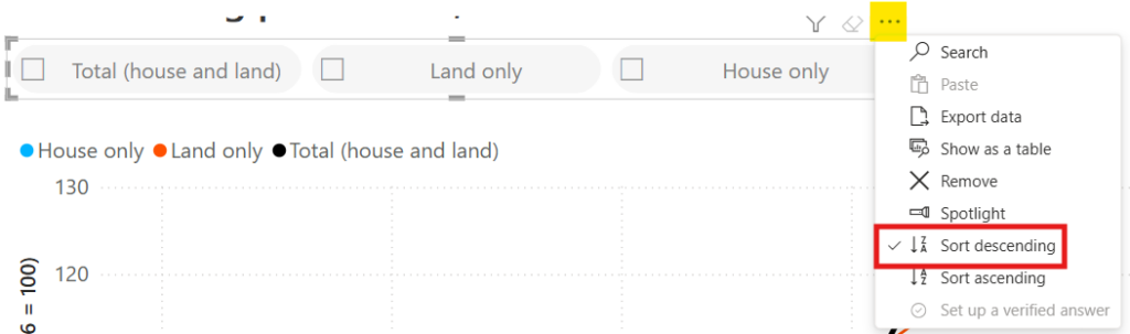
Once the text is styled, we sort the field so our options appear in a logical order.
In the end, we get a slicer that looks and feels like something straight out of a webapp, all with help of a Button Slicer, a hosted image, and a single DAX measure.
Wrapping it Up...
Click through the buttons and you’ll see the whole slicer come to life: a light grey pill for unselected options, a checkbox icon beside each one, and a soft blue pill with a checkmark for whichever option is active. It’s a small amount of formatting, but the payoff is a slicer that feels custom-built and an improved user experience.
Need Help Implementing Power BI at Your Organization?
Our Microsoft Certified consultants can help