

In this blog post, we walk you through how to create a waterfall chart in Power BI using the built-in Waterfall visual to show how a value changes step by step across categories between one period and the next.
A waterfall chart is one of the most useful ways to show incremental change. Instead of just showing a start and end value, it breaks down exactly what moved the number up or down in between, category by category. That makes it a natural fit for finance, HR, and pretty much anywhere you’re tracking a change over time.
Follow along to learn how to set it up in Power BI.
What We're Building
The waterfall chart we’re creating uses Power BI’s native Waterfall visual to track real GDP growth by industry on a month-over-month basis. Our example compares real GDP in November of 2024 to the same metric in October 2024. The chart breaks down exactly which industries pushed GDP up and which pulled it.
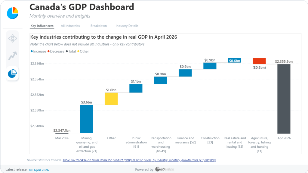
Each bar in between the starting and ending totals represents one industry’s contribution to the change. Bars are colour-coded so you can see at a glance whether an industry had a positive or negative impact, and the chart supports filtering, multiple time periods, and full control over how many categories are shown at once.
Check out the finished dashboard here.
So, how do we build it?
Step 1: Add the Waterfall Visual
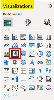
Start on a new report page. In the Visualizations pane, find and select the Waterfall chart icon, then resize it on your report canvas.
Step 2: Add the Data
With the visual selected, the Visualizations pane shows three fields to fill in: Y axis, Category, and Breakdown. Here’s how each one maps to our GDP example:
- Y-axis: this is the value you want to measure. In our case, that’s the Real GDP
- Category: what shows up along the x-axis. This is our initial and final values and is generally some measure of time. In our example, we are using the Month & Year column from our Dates table.
- Breakdown: the field that splits each change into individual positive and negative steps. Our example uses the Industry column so each bar represents one industry’s contribution to the change.
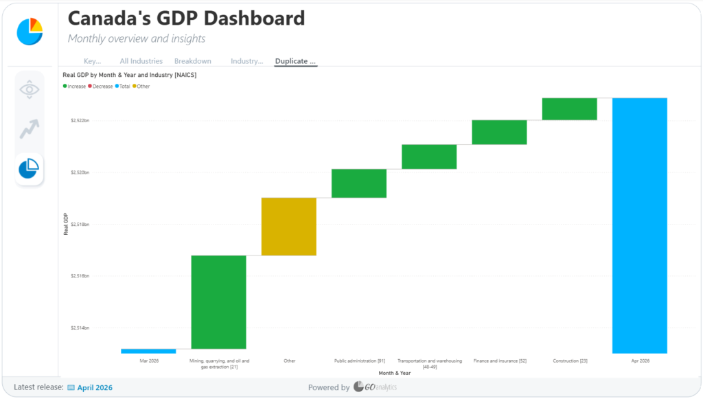
Once Category and Y-axis are set, you’ll see a starting total and an ending total, but no breakdown yet, that’s expected. Add the Breakdown field and the chart starts coming alive: you’ll see the October starting point, followed by a bar for each industry, working its way toward November.
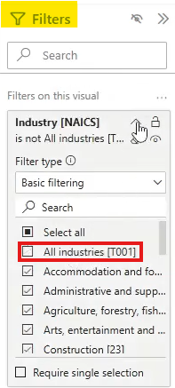
One cleanup step: if your Industry column includes an “All” bar (a rollup category), filter it out of the visual so it doesn’t get counted alongside the individual industries.
Step 3: Format the Chart
Select the visual and open the Format your visual pane. You’ll see the usual formatting options, x-axis, y-axis, legend, gridlines, but the section that’s unique to this chart type is Columns.
Column Colours
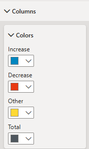
Under Columns, you can set a colour for each type of bar:
- Increase: bars that moved the total up (green by default)
- Decrease: bars that moved the total down (red by default)
- Other: anything grouped outside the top categories (yellow by default)
- Total: the start and end totals (blue by default)
You can leave these as the defaults or customize them. It’s worth keeping accessibility in mind here: green versus red can be hard to distinguish for some viewers with colour blindness, so a common swap is to use blue for increases, red for decreases, grey for totals, and keeping yellow for the Other category.
Category Spacing
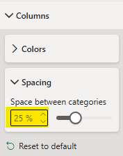
Also under Columns, you can adjust the spacing between bars (by default it sits around 20%). Increasing this narrows the bars and adds more breathing room between categories; we find that a value like 25% is a good middle ground.
Breakdown Count
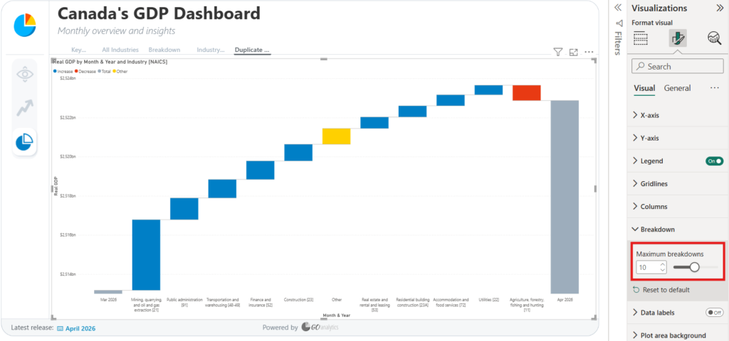
The last setting worth exploring is Breakdown, which controls how many individual categories are shown before the rest get grouped into Other. By default, Power BI shows the top five. Increasing that number will show additional categories, but showing too many can start to crowd the chart. In our example, we wanted to show a few more industries so we went with 10, which strikes a good balance between detail and readability.
Step 4: Show Change Across Multiple Periods
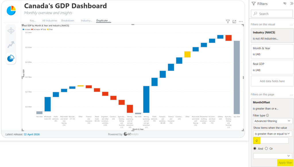
By default, the chart shows the incremental change for a single period, in our example, just October to November. You can extend this by increasing the number of periods shown. Setting it to two months, for example, adds a second breakdown: one waterfall segment showing September to October, followed by another showing October to November, all in the same chart.
From here, the rest of the formatting, data labels, colours, axis titles, works the same as it would on any other Power BI visual. The one thing that makes the waterfall chart different is that core idea of incremental change: it’s built specifically to show how you got from one number to another, not just what the two numbers are.
Wrapping it Up...
Waterfall charts are one of the most effective ways to show incremental change in a Power BI report. With the native Waterfall visual, you can turn a simple before-and-after comparison into a chart that tells the whole story of how you got there.
Need Help Implementing Power BI at Your Organization?
Our Microsoft Certified consultants can help