In this blog post, we demonstrate how to conditionally format line charts in Power BI.
Conditional formatting in Power BI is a powerful way to make data visualizations more insightful. However, one common frustration among users is the inability to directly conditionally format line charts.
If you’ve ever tried to dynamically change the colour of your line chart based on a condition – such as making it green when a value is positive and red when negative – you might have found that the built-in formatting options do not provide an easy way to do this.
Luckily, there’s a trick! In this guide, we will walk you through a simple yet effective method to conditionally format your line charts in Power BI. Let’s get started!
Challenge: No Built-in Conditional Formatting for Line Charts
When working with line charts in Power BI, you may have noticed that under the Format pane, there is no option to apply conditional formatting to the line itself. The only available setting allows you to choose a single color for the entire line – which isn’t useful when you want dynamic colour changes.
Let’s follow a simple example using some Canadian gross domestic product (GDP) data. In this example, we are sourcing monthly GDP data from Statistics Canada and we have created a measure for GDP growth (%).
What We Want to Achieve
We want to plot GDP over time and provide signals of when GDP increased or decreased. We want a line chart where:
- The line turns blue when the Real GDP Growth (%) is positive
- The line turns red when the Real GDP Growth (%) is negative
Advanced option: add arrow markers to indicate the direction of the change
Want to follow along with our example? Download our free Power BI template file!
-
Free Power BI Template: Conditional Formatting Line Charts in Power BI Download this step-by-step trick to conditionally format line charts...
-
Free Power BI Template: Conditional Formatting Line Charts in Power BI Download this step-by-step trick...
Step 1: Convert Your Line Chart into a Column Chart
Since Power BI allows conditional formatting for column charts, our workaround involves leveraging this feature. Follow these steps:
- Start with a line chart: plot your data using a standard line chart visualization.
- Switch to a clustered column chart: select your chart and then, in the Visualizations pane, switch from a line chart to a clustered column chart.
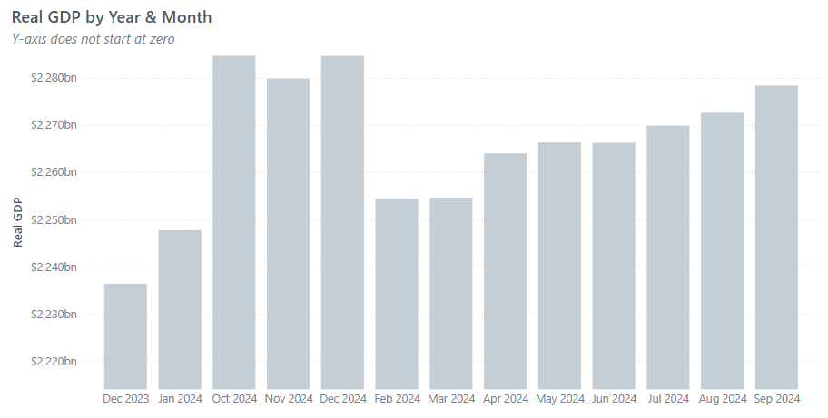
Step 2: Apply Conditional Formatting to the Column Chart
Now that we have a column chart, we can apply conditional formatting:
- Go to the Format pane, expand Columns, and select Colors
- Click on the fx button to open the conditional formatting settings
- Under Format style, select Rules
- Select the measure to base the conditional formatting on – in our case, this is the Real GDP Growth measure
- Use the following logic:
- If Real GDP Growth >= 0 then colour = blue
- If Real GDP Growth < 0 then colour = red
- Click OK to apply the changes

Step 3: Convert Back to a Line Chart
Now that the conditional formatting is applied, all we have to do is convert the chart back to a line chart. Simply navigate to the Visualizations pane and switch from a clustered column chart back to a line chart.
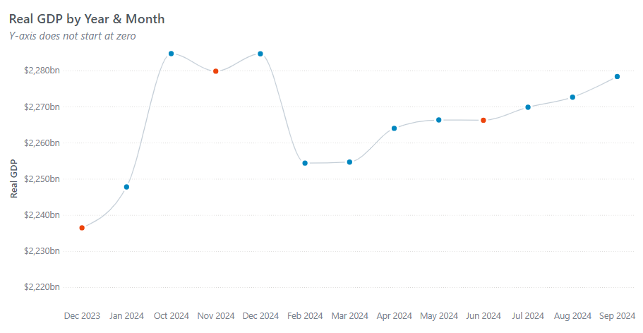
That’s it! Your line chart now dynamically changes colour based on the Real GDP growth values. You will notice this by the different marker colours.
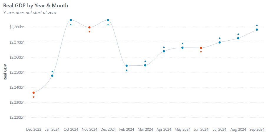
Step 4 (Advanced Option): Adding Directional Arrow Markers
To make the visualization even clearer, we can add arrows to indicate positive and negative changes:
- Create a new measure to determine the arrow symbol
UpDownArrow = IF([Real GDP Growth (%)] >= 0, “▲”, “▼”)
- Enable Data Labels in the Format pane
- Add the UpDownArrow measure as a label
- Apply Conditional Formatting to match the arrow color with the line color:
- Blue for positive growth (▲)
- Red for negative growth (▼)
Wrapping It Up
For anyone looking to enhance their Power BI reports with dynamic, visually engaging line charts, this trick is a must try. By leveraging conditional formatting in column charts and switching back to a line chart, you can effectively highlight key trends in your data.
Need Help Getting Started With Power BI?
Our Microsoft Certified consultants can help with the implementation of Power BI in your organization



![Read more about the article [How To] Import Data from Google Analytics into Power BI](https://goanalyticsbi.com/wp-content/uploads/2023/01/Blog-Feature-Image-Connect-to-Google-Analytics-300x157.png)
