In this blog post, we show you step-by-step how to create a histogram and cumulative frequency distribution chart in Power BI.
Understanding the distribution of the metrics we work with is an important part of a data analyst’s work as it can lead to drastically different recommendations.
As an example, consider the distribution of incomes in most countries. In such cases, most of the population is concentrated at the lower end of the distribution, with a smaller proportion of high-income earners. If policymakers only look at the average income levels, they will be basing their decisions on a biased measure of central tendency. This is because the average will be skewed by extreme high-income earners. For example, policymakers may determine that the average income level is $40,000 per year, when in fact, most of the population (over 50%) earn less than this amount. This can lead to harmful income tax implications.
This blog post aims to assist Power BI users in creating a histogram and cumulative frequency distribution combo chart. This type of visual, represented by a line and clustered column charts, is useful for visualizing the distribution of metrics and the cumulative percentage across all bins.
We will tackle this challenge by using an example from a fictitious bike manufacturer who wishes to analyze salespeople’s quota attainment.
Download sample data and .pbix file
Want to follow along with our example? Download our free Power BI template to see how we set up the data in Power Query, create DAX measures, and visualize the data in a histogram and cumulative frequency distribution chart.
-
Free Power BI Template for Histograms and Frequency Distributions Take your data analysis to the next level with this ready-to-use...
-
Free Power BI Template for Histograms and Frequency Distributions Take your data analysis to the...
The Task
Sales representatives at a bike manufacturing company are evaluated and paid a commission on how much of their quarterly quota they were able to attain. To determine if this evaluation and pay structure is fair, management has asked the data analyst (you!) to analyze quarterly attainment data. Specifically, we need to know how many sales representatives attained 10-20%, 21-30%, 31-40%, 41-50%, 51-60%, 61-70%, 71-80%, 81-90%, 91-100%, 101-110%, 111-120%, 121-130%, 131-140%, 141-150%, and +151% of their quarterly quota amounts.
Our dataset is structured into four columns: Rep Name, FY-Q (fiscal year and quarter), Quota, Quota Credit, and Attainment (quarterly quota credit divided by quota). This CSV file for the 2022 fiscal year has been shared with us.
Data Preparation
We will load this data into Power BI by using the Text/CSV data connector. As is highly recommended, we will click on Transform Data to see the structure of our data and make any data modifications before analysis using the Power Query Editor.
After gaining an understanding of the data, we can proceed to create the bins for organizing our quota attainment (i.e. the percentage spreads specified in the task section above). Let’s call this column Attainment (Buckets).
From the Add Column tab in Power Query Editor, select Custom Column. Change the column name to Attainment (Buckets). The code below separates our Quota Attainment into the 10 percentage point buckets up to 150%. This column will be useful to bin the number of sales representatives (frequency) into the specified bins.
#"Added Attainment Buckets" =
  Table.AddColumn(#"Changed Type", "Attainment (Buckets)",
    each if [Quota Attainment] <= 0.10 then "0-10%"
    else if [Quota Attainment] <= 0.20 then "11-20%"
    else if [Quota Attainment] <= 0.30 then "21-30%"
    else if [Quota Attainment] <= 0.40 then "31-40%"
    else if [Quota Attainment] <= 0.50 then "41-50%"
    else if [Quota Attainment] <= 0.60 then "51-60%"
    else if [Quota Attainment] <= 0.70 then "61-70%"
    else if [Quota Attainment] <= 0.80 then "71-80%"
    else if [Quota Attainment] <= 0.90 then "81-00%"
    else if [Quota Attainment] <= 1 then "91-100%"
    else if [Quota Attainment] <= 1.1 then "101-110%"
    else if [Quota Attainment] <= 1.2 then "111-120%"
    else if [Quota Attainment] <= 1.3 then "121-130%"
    else if [Quota Attainment] <= 1.4 then "131-140%"
    else if [Quota Attainment] <= 1.5 then "141-150%"
    else if [Quota Attainment] > 1.5 then "+151%"
    else "Other",
    type text
  ),
Before closing the Power Query Editor, we will also need to create another column that we will call Attainment Order. This column will simply order our quota attainment buckets in ascending order. This will be useful when we create our cumulative percentages measure and to make sure our Attainment (Buckets) displays in the correct order when we put it in a visual. The code below creates this column (Note: you can use the Advanced Editor to copy and paste the code from above and make small modifications).
#"Added Attainment Order" =
  Table.AddColumn(#"Added Attainment Buckets", "Attainment Order",
    each if [Quota Attainment] <= 0.10 then 0.1
    else if [Quota Attainment] <= 0.20 then 0.2
    else if [Quota Attainment] <= 0.30 then 0.3
    else if [Quota Attainment] <= 0.40 then 0.4
    else if [Quota Attainment] <= 0.50 then 0.5
    else if [Quota Attainment] <= 0.60 then 0.6
    else if [Quota Attainment] <= 0.70 then 0.7
    else if [Quota Attainment] <= 0.80 then 0.8
    else if [Quota Attainment] <= 0.90 then 0.9
    else if [Quota Attainment] <= 1 then 1
    else if [Quota Attainment] <= 1.1 then 1.1
    else if [Quota Attainment] <= 1.2 then 1.2
    else if [Quota Attainment] <= 1.3 then 1.3
    else if [Quota Attainment] <= 1.4 then 1.4
    else if [Quota Attainment] <= 1.5 then 1.5
    else if [Quota Attainment] > 1.5 then 1.6
    else 99,
    type number
  )
Data Modelling
To create the histogram and cumulative frequency distribution visual we will need to create two measures. One to calculate the count of sales representatives in our dataset and one to calculate the cumulative percentage of our sales representatives.
The first is a count of employees, which is a straightforward calculation. The code below counts the number of employees by counting distinct Rep Name.
Count of Employees =
   DISTINCTCOUNT('Dummy Quota Attainment Data'[Rep Name])
The second measure calculates the cumulative percentage. Because this formula is more complex, we will break it up into three (3) different measures and at the end we will put it all together into one measure.
The first auxiliary measure we will create is a measure that gets the last Attainment Order based on the context of the visual (see code below). The reason we need this is that we will use it to filter our number of sales representatives in the context of the visual to create the cumulative (or running total) count of employees.
_maxAttainment =
   MAX('Dummy Quota Attainment Data'[Attainment Order])
The next auxiliary measure we will need is the count of all reps for any fiscal year and quarter. This measure will ignore all filter context except for the FY-Q column. The ALLEXCEPT function passed into the CALCULATE function changes the context to ignore all filter context except for the FY-Q column (i.e. it will ignore all filters except for any filtering applied to the FY-Q column).
The ALLSELECTED function returns a table that contains all the rows in a table, or all the values in a column, ignoring any filters that might have been applied. It can be used to remove the filters applied to a column and to show all the data in the column, without filters.
_allReps =
CALCULATE(
  [Count of Employees],
  ALLEXCEPT('Dummy Quota Attainment Data', 'Dummy Quota Attainment Data'[FY-Q])
)
The final auxiliary measure we will need is the cumulative frequency of sales representatives count (code below). This measure takes the count of sales representatives and filters it to where the Attainment Order column is less than or equal to the maximum attainment order. In the filter context, the maximum attainment order will be the bin we are currently displaying data for. This creates a cumulative count as it will sum the count of employees where the bin is the current or bins before it. The measure will consider the fiscal year and quarter we select as a filter.
_cumFreq =
CALCULATE(
  [Count of Employees],
  FILTER(
    ALLEXCEPT('Dummy Quota Attainment Data', 'Dummy Quota Attainment Data'[FY-Q]),
    'Dummy Quota Attainment Data'[Attainment Order] <= _maxAttainment
  )
)
The final step is to create the Cumulative Percentage (%) measure by dividing the cumulative frequency by all reps column. In our example, we do all of the steps highlighted above in one measure using variables (see code below), but you could create a new measure that divides the last measure (_cumFreq) by the _allReps measure to achieve the same result.
Cumulative Percentage (%) =

VAR _maxAttainment = MAX('Dummy Quota Attainment Data'[Attainment Order])

VAR _allReps =
  CALCULATE(
    [Count of Employees],
    ALLEXCEPT('Dummy Quota Attainment Data', 'Dummy Quota Attainment Data'[FY-Q])
  )

VAR _cumFreq =
  CALCULATE(
    [Count of Employees],
    FILTER(
      ALLEXCEPT('Dummy Quota Attainment Data', 'Dummy Quota Attainment Data'[FY-Q]),
      'Dummy Quota Attainment Data'[Attainment Order] <= _maxAttainment
    )
  )

RETURN
DIVIDE(_cumFreq, _allReps)
Visualizing the Data
Quick Note
Before we get to visualizing our data, we first need to make sure our Attainment (Buckets) column is ordered by Attainment Order. This will allow us to sort our visuals in ascending order by Attainment (Buckets). By default, Power BI will sort our Attainment (Buckets) in alphabetical order which means that +151% will come at the beginning of our visual instead of at the end.
To do this, select the Attainment (Buckets) column, and from the Column tools tab choose Attainment Order for the Sort by column option.

Additionally, because we are analyzing quarterly quota attainments, let’s start by adding the FY-Q column to our page level filter (add FY-Q to Filters on this page from the Filters pane). Let’s choose FY-Q = 2022-Q1 to start.
To gain a better understanding of how these formulas work to produce the desired result, we can first visualize it in a table to see how the numbers add up.
Let’s begin by adding a table visual and adding our Attainment (Buckets) column. At this point, make sure that the order that the bins appear makes sense (i.e. 0-10%, 11-20%, etc.).
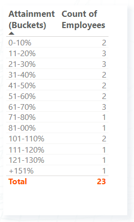
Next, let’s add the Count of Employees measure to the table. From this initial table, we can see that we had 23 sales representatives in 2022-Q1 but only 5 reps achieved 100% or more of their quota (see the image below).
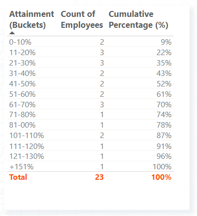
Finally, let’s add the Cumulative Percentages (%) to the table. As can be seen from the screenshot below, the Cumulative Percentages (%) measure will continually increase until reaching 100% in the last bin. The first row of the table shows a cumulative percentage of 9% as 2 out of 23 sales representatives attained 0-10% of their quota in 2022-Q1. If we look at the following row, we see a cumulative percentage of 22% as 5 (2+3) out of 23 sales representatives attained between 0% and 20% of their quota in 2022-Q1.
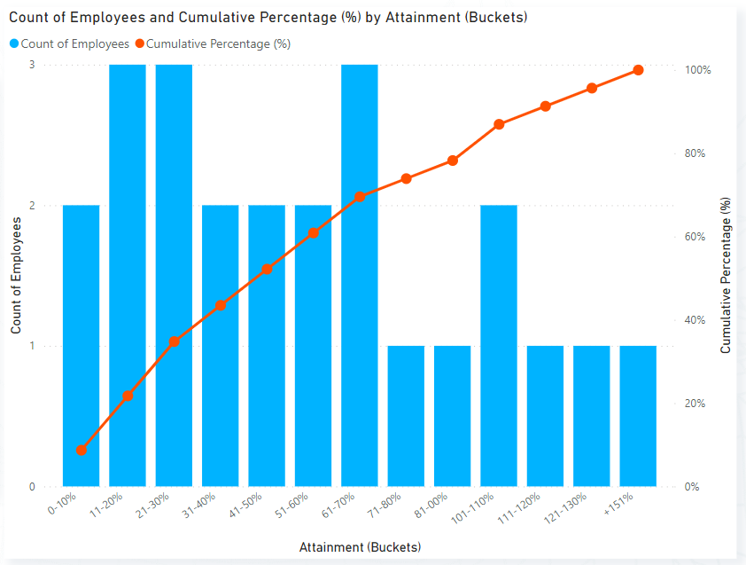
Now, let’s put our measures in the Line and clustered column chart so that we can view this data in a histogram and cumulative frequency distribution chart. To create the visual, we add Attainment (Buckets) to the X-axis, Count of Employees to Column Y-axis, and Cumulative Percentage (%) to the Line Y-axis (see image below).
We can also visualize both our chart and our table together to make it easy to read numbers from our report page (see image below).
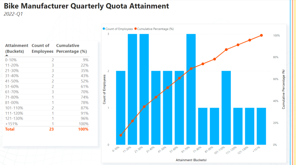
The report page can now help management understand that most sales representatives attained 70% or less of their assigned quota in 2022-Q1. In fact, by looking at the cumulative percentage, management can see that 70% of all sales reps attained 70% or less of their assigned quota.
Concluding Thoughts
The Line and clustered column chart is a powerful visual for depicting a histogram and cumulative frequency distribution in Power BI. This type of visual can provide valuable insights into the distribution of your metrics, which can help you make more informed decisions when providing recommendations.
It’s important to note that the dataset used in this demonstration was created randomly, resulting in significant variations quarter over quarter. As such, the dataset should not be interpreted and was only used for the purpose of demonstrating how to create this type of visualization in Power BI.
Need Help Getting Started With Power BI?
Our Microsoft Certified consultants can help with the implementation of Power BI in your organization

![You are currently viewing [How To] Create a histogram and cumulative frequency distribution chart in Power BI](https://goanalyticsbi.com/wp-content/uploads/2022/12/Blog-Feature-Image-Template-2.png)

![Read more about the article [How To] Replace Column Values in Power Query](https://goanalyticsbi.com/wp-content/uploads/2024/03/How-to-replace-column-values-300x157.png)

Thank you! I’ve been struggling with this and you laid it out here so clearly.
Thank you soooo much for this. It was perfectly outlined to how i wanted to create my histogram.
Such a savior
Glad it was helpful! Keep on analyzing 😃