Designing and developing effective Power BI reports can transform how your team uses data to make decisions. But! Even with the best tools and intentions, many reports fall flat – unused, misunderstood, or overwhelmed with irrelevant information.
These failures can be traced back to a common yet avoidable mistake: not designing reports and dashboards with the end user in mind.
In this blog post, we explore why this mistake happens, how to avoid it, and how focusing on your audience’s needs can lead to reports that actually provide actionable insights – and get used.
Why Not Designing for the End User is a Problem
Microsoft Power BI and other data visualization tools available are powerful tools, but their success depends on how effectively reports and dashboards can deliver insights.
At the end of the day, Power BI reports get used if, and only if, they provide insights to decision-makers – not because someone in IT had all the right intentions to create a Frankenstein-of-a-dashboard that encompasses every metric and key performance indicator (KPI) available to mankind.
When working with clients on report design optimization, we often encounter three simple mistakes that lead to poor user adoption. Reports that fail to address the needs of their users often:
Contain too much information
Oftentimes, although right-intentioned, developers of Power BI reports will make the common mistake of adding too much or irrelevant information. This is because they are not designing with the end user in mind – instead, they are trying to “cover their bases” so they add many metrics and KPIs that they think will be useful in the report or dashboard.
When reports include every metric available, users will struggle to focus on what truly matters, leading to analysis paralysis or important insights being overlooked.
Overwhelm users with complex visuals
The old saying from grade school applies when designing effective dashboards. K.I.S.S. – Keep it simple student. Reports and dashboards filled with dense graphs, excessive filters, or unnecessary formatting can confuse users and make it harder for them to find actionable insights quickly.
Miss the mark on what decisions need support
When designing reports and dashboards in Power BI, it is important to ask a crucial question: what decision(s) will this report support? Without a clear understanding of the audience’s goals, reports often present data that doesn’t align with their decision-making needs, resulting in frustration and disengagement.
How This Mistake Happens
So, how is it that Power BI reports and dashboards are developed without the end user in mind?
Reports that fail to deliver actionable insights – and don’t get used – are often built with a focus on technical features or data completeness, rather than the practical needs of the people who will benefit from them.
One of the reasons why reports can sometimes be built with a focus on technical features rather than usefulness to the end user is that there are unclear objectives – there is no alignment between the report’s purpose and the business goals.
Another common reason is that there is a lack of collaboration between technical and business teams. When there is minimal input from stakeholders during the design phase, it is more likely that Power BI reports will miss the mark.
How to Avoid This Mistake
The good news is that it’s not complicated to avoid the number one mistake why Power BI reports fail to provide insights and sit in workspaces unused.
Designing effective Power BI reports does not require reinventing the wheel. There are some key strategies that data teams and analysts can start implementing today to design and develop Power BI reports that are intuitive, provide clear and actionable insights, and will be used. By focusing on these key strategies, you can ensure your reports meet your team’s needs and expectations.
1. Start with clear goals
- Define the report’s purpose: what decisions should this report or dashboard support?
- Identify the target audience: who will use the report, and what is their level of technical expertise?
2. Prioritize actionable insights
- Focus on the metrics and KPIs that matter to the specific business unit.
- Remove unnecessary data or visuals that clutter the report and do not align with the purpose.
3. Simplify visualizations
- Use clear, intuitive charts that are appropriate for the metric or KPI. For example, bar charts can be used for comparisons and line charts for trends.
- Avoid overcrowding your reports or dashboards with too many visuals – less is more.
4. Make it interactive
- One of the best things about Microsoft Power BI, and other data visualization tools, is that they allow you to provide a high-level overview of metrics and KPIs while also allowing users to dive deeper. Use this to your advantage. Add slicers and filters so users can explore the data that’s most relevant to them.
- Include drill-through capabilities. Some users will be power users and will require nitty-gritty details. Use drill-through pages in Power BI to allow deeper insights when needed.
5. Involve stakeholders early
- Share prototypes and wireframes with users and gather feedback. This will ensure design aligns with end-users’ expectations and will also save on report development time. Bonus!
- Iterate based on the input provided by end users to ensure the final report addresses their needs.
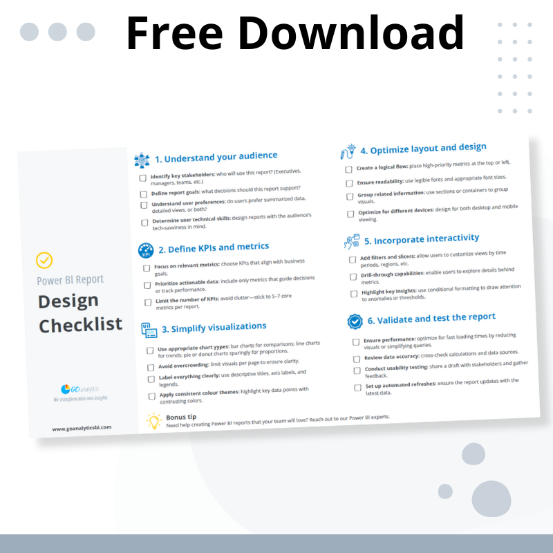
Want to build reports that work? Download our free Power BI report design checklist!
We put together a simple, actionable checklist to guide you through the process of designing Power BI reports that deliver results.
-
Unlock the secrets to creating impactful Power BI reports with our free, actionable checklist. From defining audience needs to optimizing layouts and visuals, this guide ensures your dashboards deliver actionable...
-
Unlock the secrets to creating impactful Power BI reports with our free, actionable checklist. From...
Benefits of Designing with the End User in Mind
When you design reports with the end user in mind, you avoid the #1 mistake that leads to ineffective reports in Power BI. By prioritizing the needs of the target audience, Power BI reports will generate key benefits for your organization such as driving better data-driven decisions, increased Power BI adoption rates, and maximizing your Power BI return on investment.
Driving better data-driven decisions
At the heart of a Power BI implementation is the desire for actionable insights at your fingertips at any time. Power BI has the potential to efficiently serve insights – not data – to users across the organization with the caveat that they must add value to end users. Reports that are tailored to the users’ specific needs enable quicker and more informed decision-making.
By focusing on relevant KPIs and providing clear, actionable insights, users can confidently identify key trends, evaluate performance, and take timely action.
Increased Power BI adoption rates
Organizations make the investment in Power BI because they want to capitalize on better data-driven decision-making. This is only possible if users are on board and adopt the tool and reports shared with them.
When reports are designed with usability in mind, they are more likely to be embraced by teams. Simplified layouts, intuitive navigation, and well-chosen visuals make it easier for users to interact with the data. This increases trust in the system and reduces reliance on outdated manual processes (*ahem, ahem* Excel spreadsheets), ensuring the investment in Power BI is fully utilized.
Maximizing ROI
Reports that answer critical business questions and are widely adopted allow organizations to unlock the full potential of their Power BI implementation.
Efficient, user-focused reports and dashboards reduce time spent searching for data, minimize errors, and ensure that data insights directly contribute to the organization’s strategic goals.
The result? A measurable return on investment through improved efficiency and better business outcomes.
By focusing on relevant KPIs and providing clear, actionable insights, users can confidently identify key trends, evaluate performance, and take timely action.
Need Help? Let's Talk.
Struggling to create reports that resonate with your team? Our Power BI experts specialize in designing user-friendly dashboards tailored to your business goals. Whether you need help with implementation, report optimization, or training, we’re here to help.



![Read more about the article [How To] Remove Unwanted Columns in Power Query Editor](https://goanalyticsbi.com/wp-content/uploads/2023/03/Remove-unwanted-columns-in-PQ-300x157.png)