2024 was a big year for Power BI and our consulting team! From transforming raw data into stunning visuals to solving complex reporting challenges, we had a year full of impactful insights and delivered business intelligence solutions that ‘wowed’ our clients.
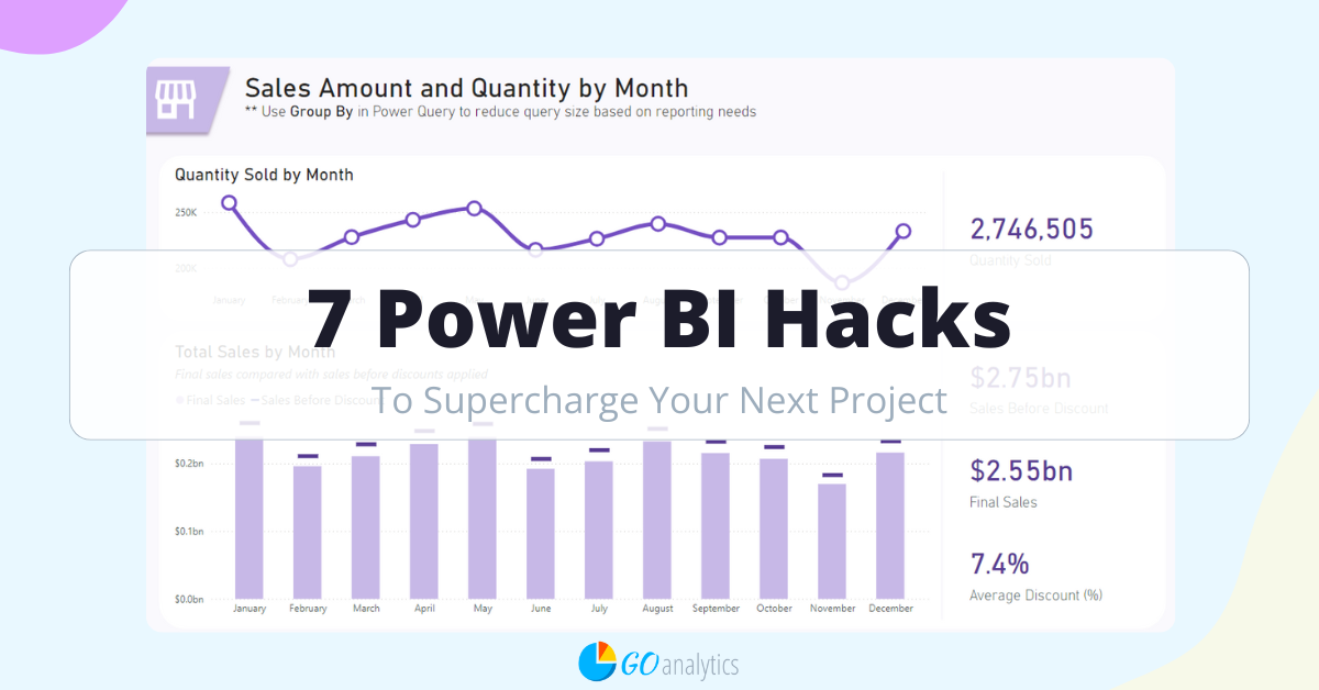
To celebrate the end of the year, we wanted to share 7 Power BI hacks that helped us deliver exceptional results for our clients. Using these techniques we created smarter, faster, and more interactive dashboards – and we’re excited to share them with you.
Oh, and stick around until the end of this blog post for a special surprise.
Hint: it’s a free Power BI template showcasing how to implement all these techniques!
Let’s dive in!
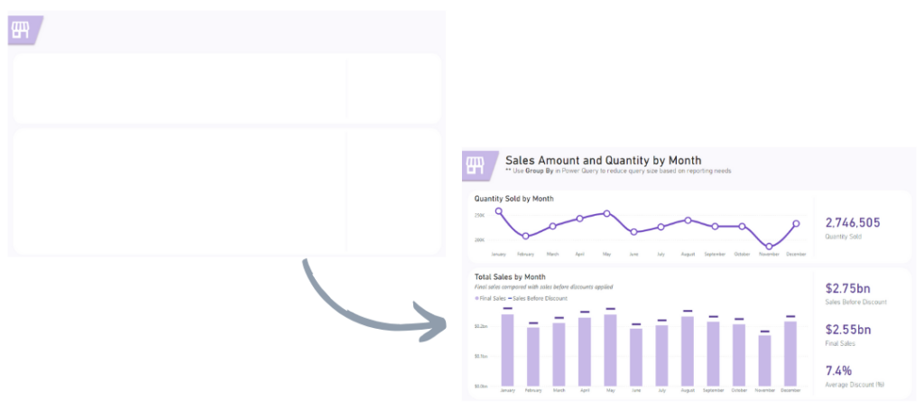
1. Creating Report Layouts Outside of Power BI
What is it? Instead of starting the dashboard design process directly in Power BI, we used tools like Adobe, Figma, Canva, and don’t forget the trusted PowerPoint. These external tools allow great flexibility during the design phase to create wireframes, mockups, and prototypes.
Why it’s awesome? Starting the design process outside of Power BI solves the problem of misaligned expectations between stakeholders and developers. By presenting a clear visual concept before building, you avoid unnecessary iterations. It’s also a great way to minimize the number of visual elements on each report page, which can boost overall performance by minimizing resource demand.
How it helps:
- Aligned stakeholders: early mockups ensure everyone is on the same page. Pro tip: you can request sign offs on design before the development stage.
- Improved report performance: fewer elements per page lead to faster load times and a smoother navigation for end users.
- Encouraged creativity: by designing outside of Power BI, you can experiment with bold, innovative designs without worrying about constraints in Power BI. Those can be ironed out later.
- Streamlined development: with a clear visual guide, the dashboard build process is much faster and more efficient.
2. Reducing Query Sizes by Using Group By in Power Query
What is it? The Group By feature in Power Query is a game changer if you’re working with large datasets. It allows for the aggregation of data at the query level, reducing the dataset size before it reaches the Power BI model. For example, aggregating hourly data to report it daily.
Why it’s awesome? This hack addresses performance bottlenecks caused by large datasets. Aggregating data early reduces report load times and makes the entire process smoother.
How it helps:
- Improved performance: dashboards load faster and are more responsive.
- Simplified data models: reduces complexity in the data model.
- Enhanced usability: end users have a smoother experience exploring reports that are quick to load and respond quickly to on-report interactions.
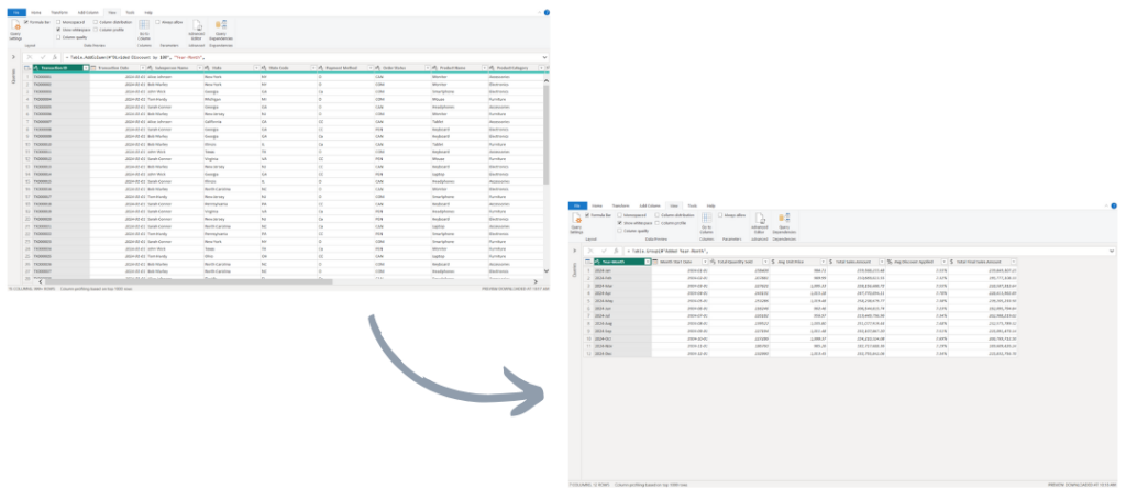
For a detailed how-to guide, check out our How to Reduce Number of Rows by Using Group By in Power Query (Power BI & Excel) video on YouTube.
3. Replacing Multiple Column Values in One Step
What is it? Using conditional logic in Power Query, we were able to replace multiple column values in a single step, eliminating repetitive manual edits.
Why it’s awesome? With a little M programming, we are able to significantly reduce the time and effort needed to clean data, ensuring consistency across datasets while minimizing the risk of human error.
How it helps:
- Saves time: standardized datasets in minutes.
- Improved performance: reduces the number of applied steps in Power Query.
- Increased accuracy: reduces errors from manual processes.
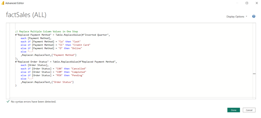
For a detailed how-to guide, check out our Replace Multiple Column Values in One Step [Power Query Tips & Tricks] video on YouTube
4. Using Small Multiples
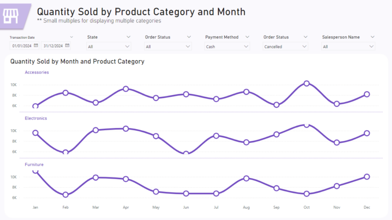
What is it? The Small Multiples option allows your visuals to display charts side-by-side, allowing for easy comparison of trends across categories.
Why it’s awesome? Allows for comparing data across regions, products, or other dimensions in a single view while simplifying the overwhelming of multiple visuals.
How it helps:
- Clearer insights: compare trends across categories at a glance.
- Improved report performance: fewer visuals on a report page.
5. Adding Dynamic Titles Using DAX
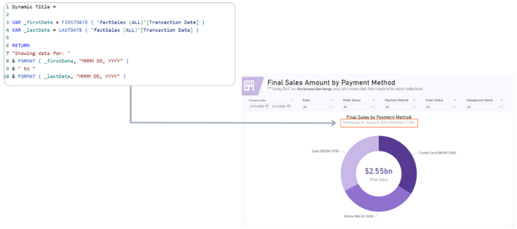
What is it? Dynamic titles in Power BI use DAX measures to update automatically based on user interactions with slicers and filters.
Why it’s awesome? Static titles often fail to convey the current context of a report. Dynamic titles provide clarity by reflecting the user’s selections.
How it helps:
- Provides context: enables users to instantly understand the scope of the data.
- Improved readability: reduces the need for extra explanations or labels.
- Elevated professionalism: makes dashboards feel polished and user-centric.
6. Using Bookmarks
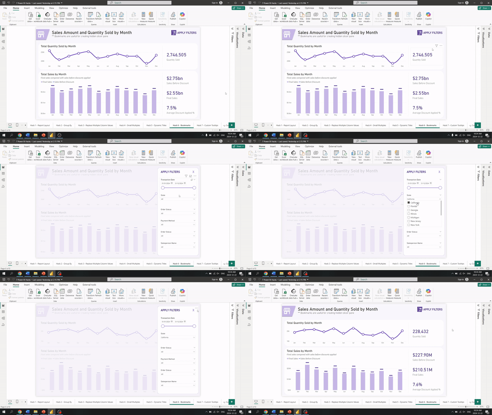
What is it? Bookmarks in Power BI allows us to create togglable content that can be hidden or displayed as needed. For example, a hidden pane for applying slicer selections keeps your reports simple and clean.
Why it’s awesome? Dashboards can become cluttered with too many elements, like visible slicer filters. Using Bookmarks allows us to keep the interface clean while providing advanced features, like filtering options.
How it helps:
- Keeps dashboards clean: reduced visual clutter.
- Improved usability: content can be available when needed without overwhelming the user.
- Streamlined design: enhances the overall user experience.
7. Using Custom Tooltips
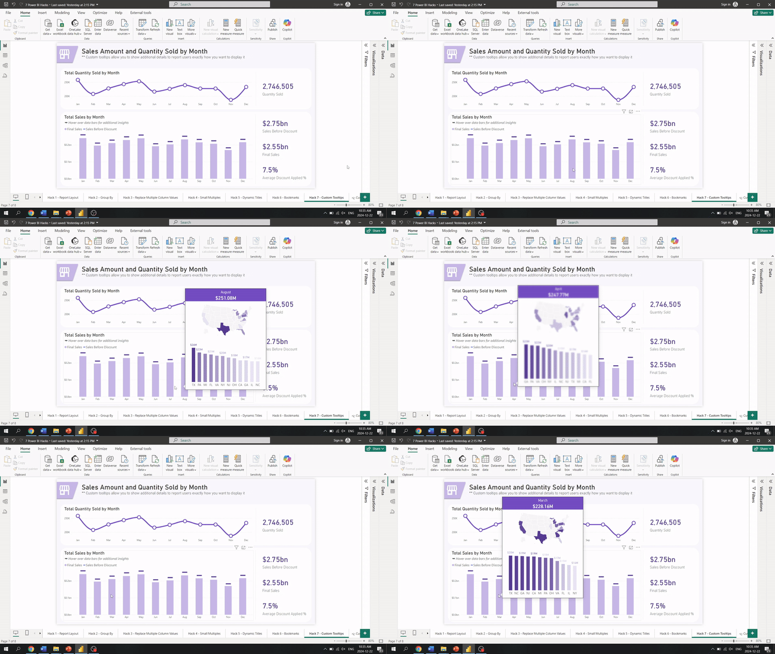
What is it? Custom tooltips in Power BI provide additional details when users hover over visuals, offering mini-charts or detailed context.
Why it’s awesome? Dashboards often struggle to balance detail and simplicity. Custom tooltips add depth without overcrowding the main visuals on a report page.
How it helps:
- Deliver context: explain visuals without overwhelming design.
- Engage users: encourages exploration by providing extra insights.
- Delight clients: combine functionality with sleek, interactive design.
Get hands-on with these hacks!
Download our free Power BI Hacks Template, featuring pre-built examples for each technique discussed in this blog post.
-
Transform your dashboards with our 7 Power BI Hacks Template—a ready-to-use, downloadable package showcasing 7 powerful techniques to elevate your...
-
Transform your dashboards with our 7 Power BI Hacks Template—a ready-to-use, downloadable package showcasing 7...
Wrapping It Up...
These 7 hacks in Power BI are not just tricks – they are transformative techniques that elevate your reports’ design and performance. For Power BI beginners and pros alike, these ideas can enhance your work and inspire new possibilities.
As we close 2024 and step into 2025, we’re excited to continue pushing the boundaries of delivering even more impactful solutions. Be sure to bookmark our blog post and, if you haven’t yet, subscribe to our YouTube channel for much more on Power BI for this coming year.
Need Help Getting Started With Power BI?
Our Microsoft Certified consultants can help with the implementation of Power BI in your organization
